01 — ServicesInformation Architecture, Design System, Web Design, E-commerce, B2B2C
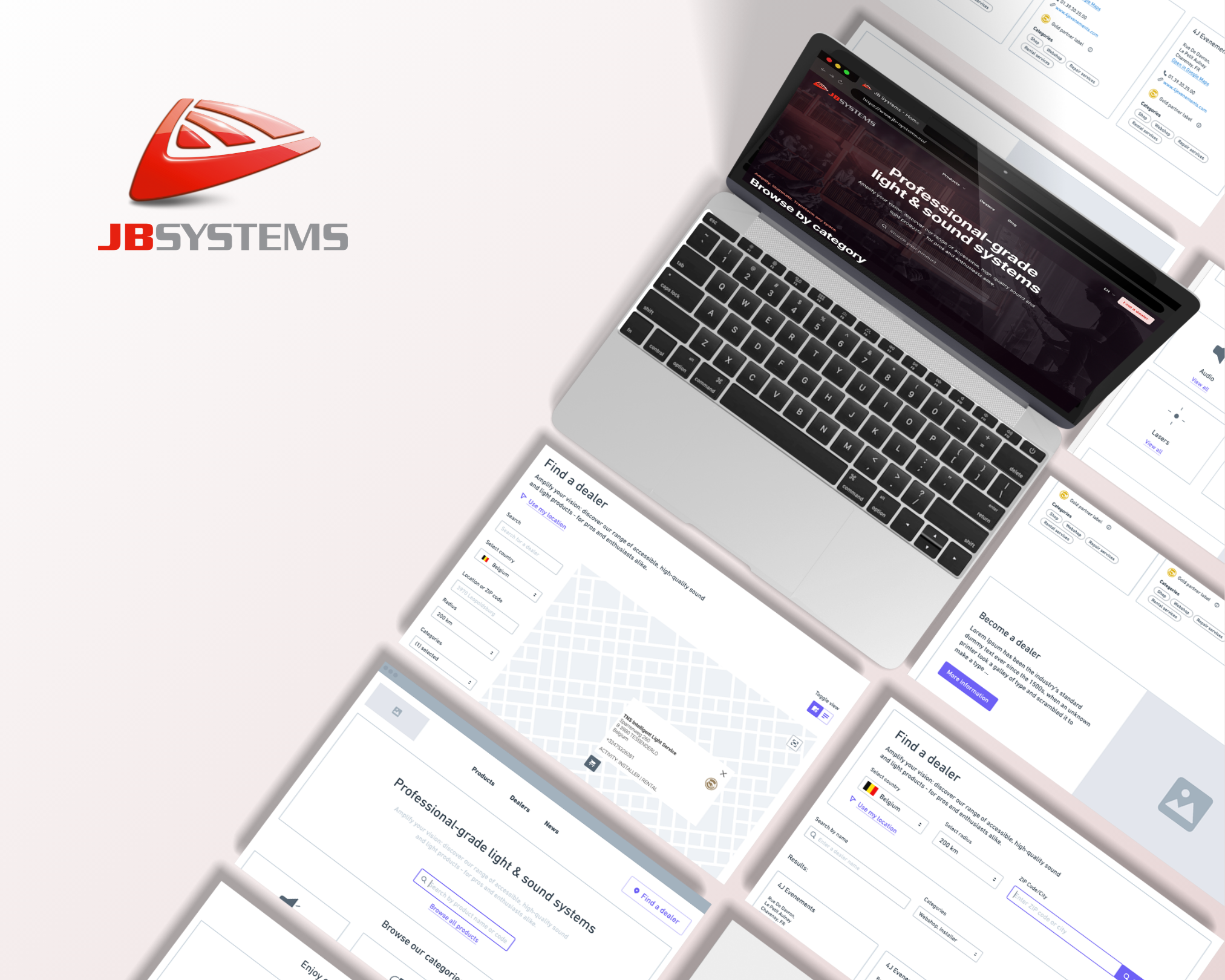
02 — SummaryJB Systems is a Belgian pro-sumer sound and light brand with over 50 years of heritage, whose broad product catalogue and dual professional/enthusiast audience demanded a more thoughtful digital presence. The project involved a full website redesign and information architecture overhaul - restructuring navigation around Sound and Light as distinct category pillars, improving product discovery across a 200+ SKU range, and surfacing brand storytelling that had previously been buried. The result is a site that guides both seasoned professionals and hobbyist buyers more confidently from landing to product, while positioning JB Systems's heritage and quality more credibly from the first scroll.
In collaboration with Two Point Zero Consultancy (Gavere, BE).
03 — ContextA trusted brand in need of a modern digital presence
JB Systems is a registered trademark of BEGLEC, a Belgian sound and light distributor with over 50 years of experience in the industry. The brand serves both professional users and enthusiastic hobbyists — a dual audience that creates real navigational complexity.
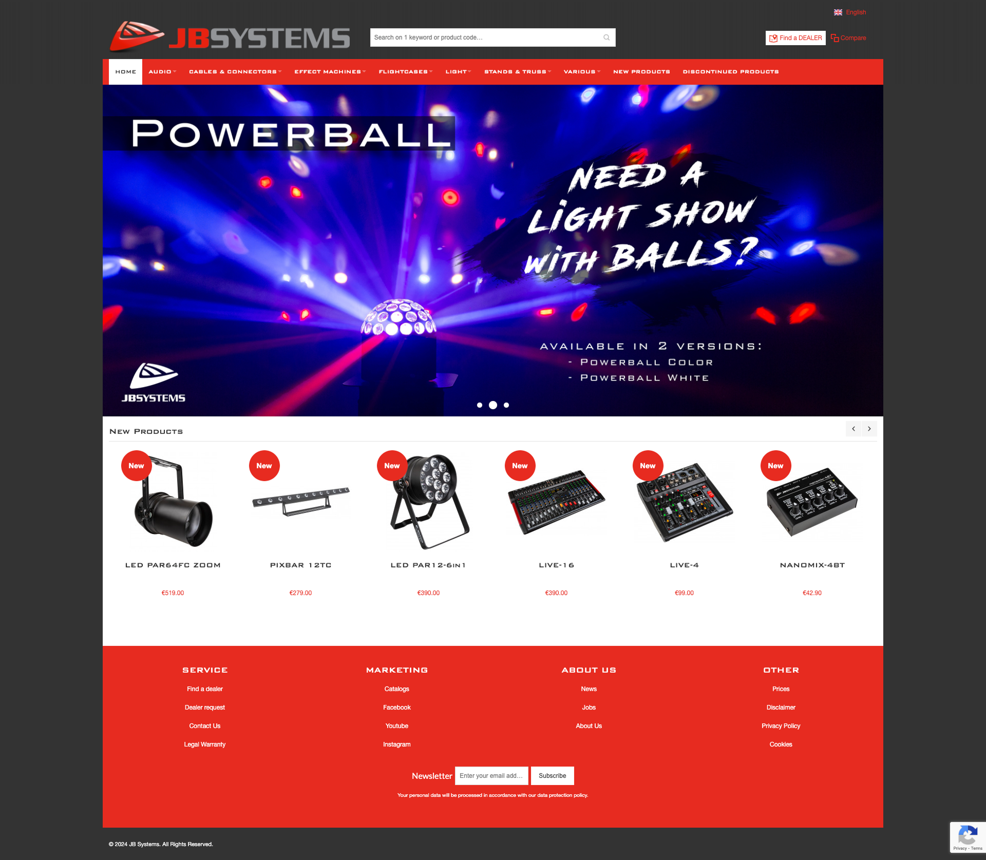
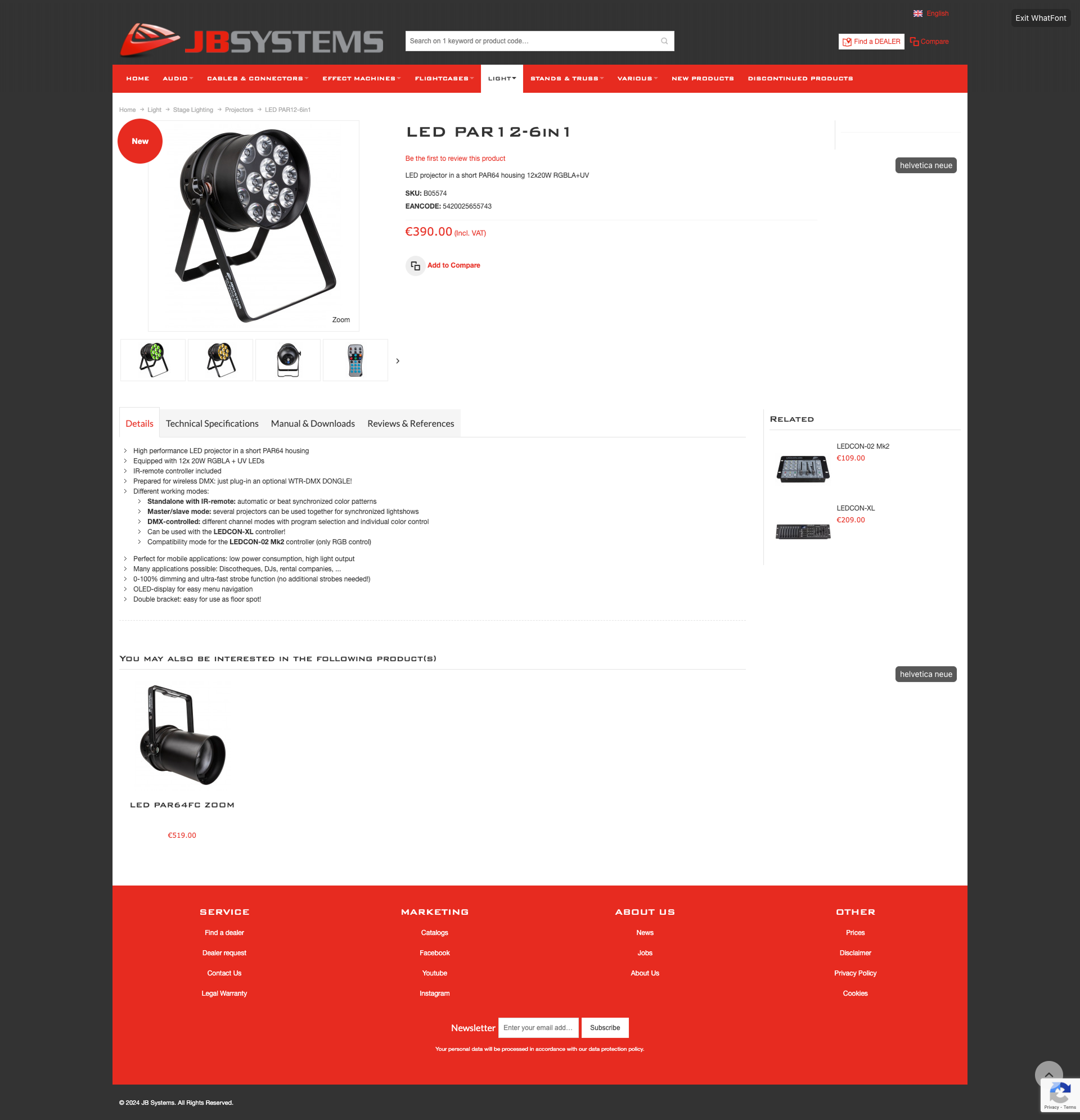
The product catalogue is broad: active speakers, PA mixers, moving-head lights, LED fixtures, lasers, media players, wireless systems. Despite the depth and quality of the range, the previous website failed to convey the brand's authority or guide visitors confidently to the right product.
50+Years of industry experience behind the brand
2Distinct audiences - professionals and enthusiasts - sharing one site
What needed solving
Flat product taxonomy
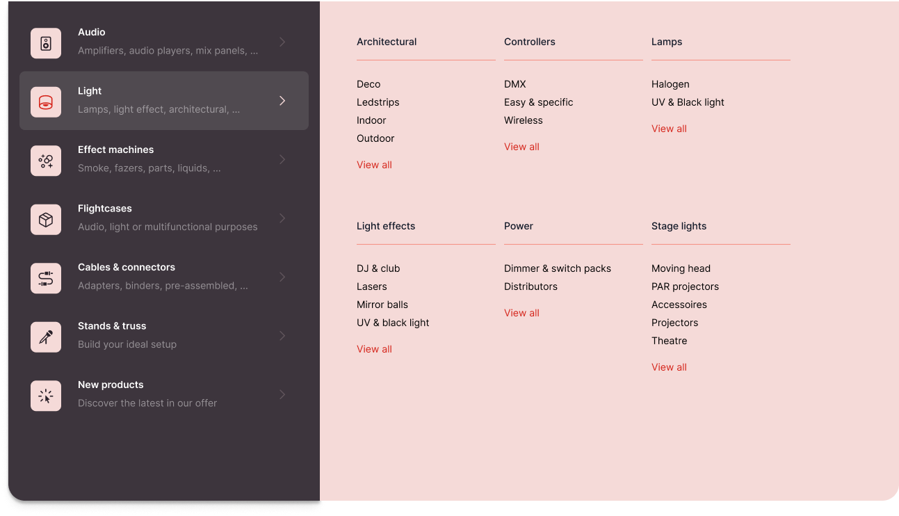
Sound and Light are fundamentally different categories, each with deep sub-hierarchies. The previous structure flattened these into a single undifferentiated list, making browsing feel overwhelming and discovery feel accidental.
Dual-audience navigation
A touring sound engineer and a hobbyist DJ have very different mental models when scanning a product range. Neither was being served with a tailored entry point.
Brand storytelling.
Belgian heritage, 50 years of distribution, pro-grade quality - this story was hidden from the audience. The homepage was product-forward without being brand-forward, missing the trust signals that convert first-time visitors.
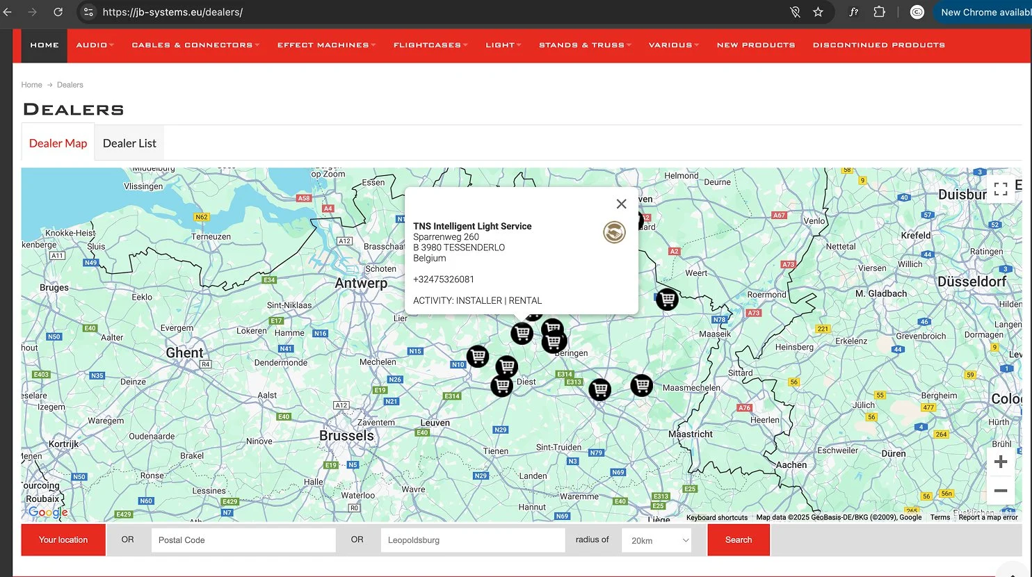
Dealer network visibility.
For a brand that sells through distributors and resellers, the path to purchase needed to surface the dealer network naturally - not as an afterthought at the bottom of the page.
Blog and editorial content without a home.
Product in-use stories (like lighting installations at Schloss Oranienburg or Expo Dino World) were valuable content assets being underused for SEO and brand positioning.
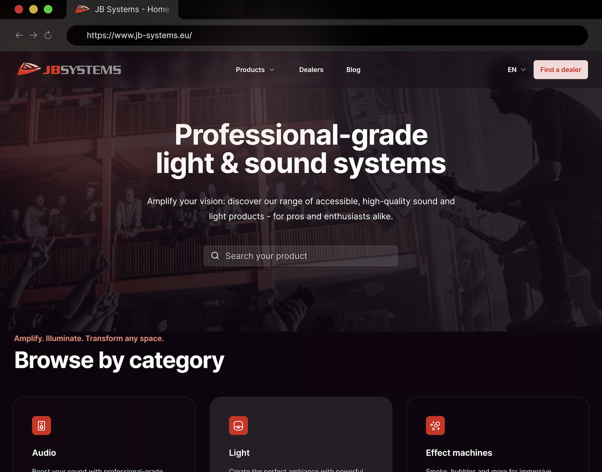
A category-first structure built around how people shop
The redesigned IA separates Sound and Light as top-level pillars, each with a clear internal hierarchy. Secondary navigation handles support, dealers, and brand content - keeping the commercial path clean and the editorial path accessible but non-intrusive.
04 — Design approachVisual language that matches the product quality
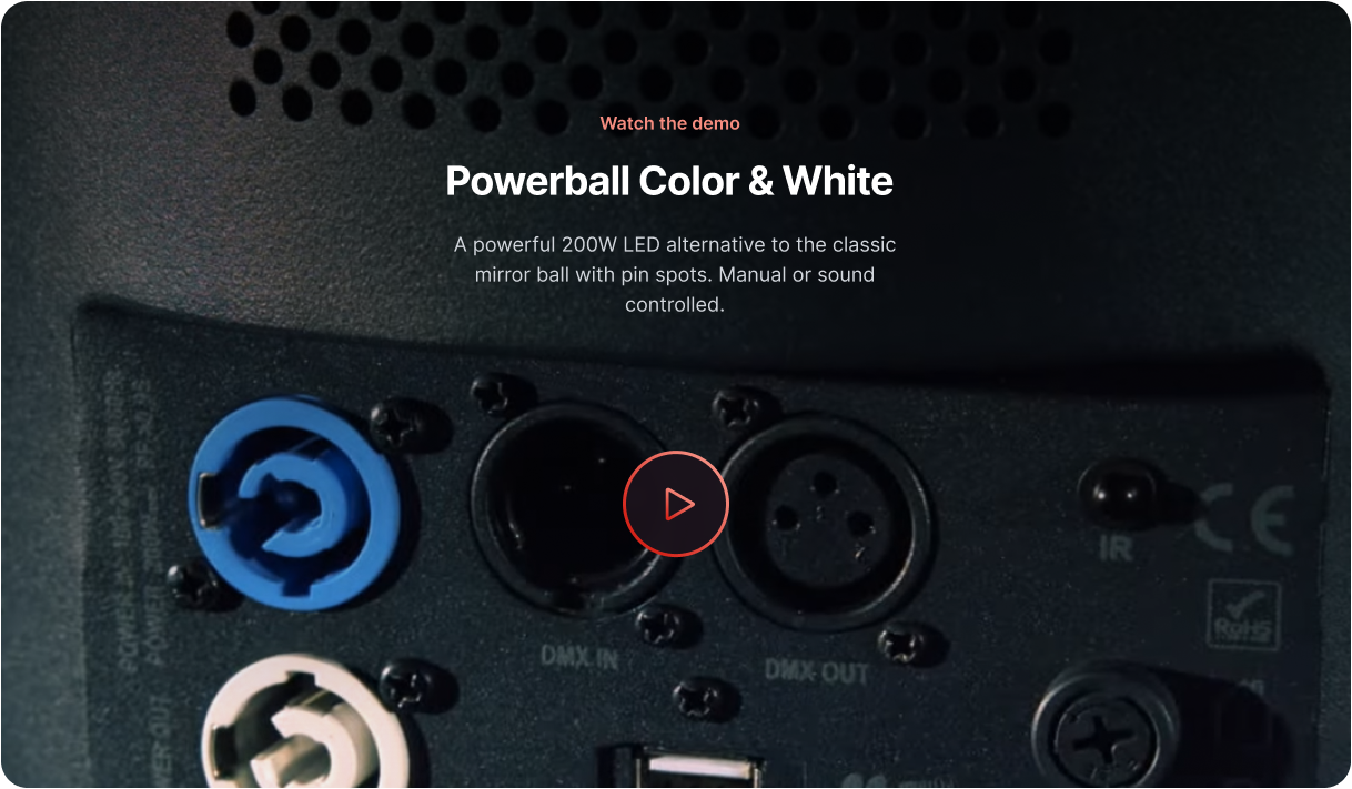
The design direction drew from the theatrical world JB Systems occupies: stages, sound systems, live events. A dark, confident visual palette anchored by strong typographic hierarchy. Product imagery is given space to perform. The "Amplify. Illuminate. Transform any space" tagline, already in the brand vocabulary, became the tone guide for the visual language.
Key design decisions included using product hover states to animate between off and illuminated states (showing the light products in action), a persistent global search bar to support the long-tail product catalogue, and a homepage structure that moves from category-browsing to editorial content - mirroring how both professional and hobbyist buyers actually scan a catalogue site.
05 — OutcomesWhat the redesign delivered
Clearer product discoveryCategory-first navigation reduces cognitive load for visitors browsing a 200+ SKU range across sound and light.
Dealer network integratedDealer CTA appears persistently in navigation and contextually in the footer, reducing friction on the path to purchase.
Editorial content activatedCategory-first navigation reduces cognitive load for visitors browsing a 200+ SKU range across sound and light.
Stronger brand positioningHeritage messaging and social proof ("Trusted by professionals") surfaced earlier in the browsing flow.
Let’s work together
#UXDesign #WebDesign #ProductDesign #ContentDesign #VisualDesign #ArtDirection